Images (unpic)
How to use @unpic/svelte with the Cloudflare CDN: layouts, operations, art direction, and loading strategies.
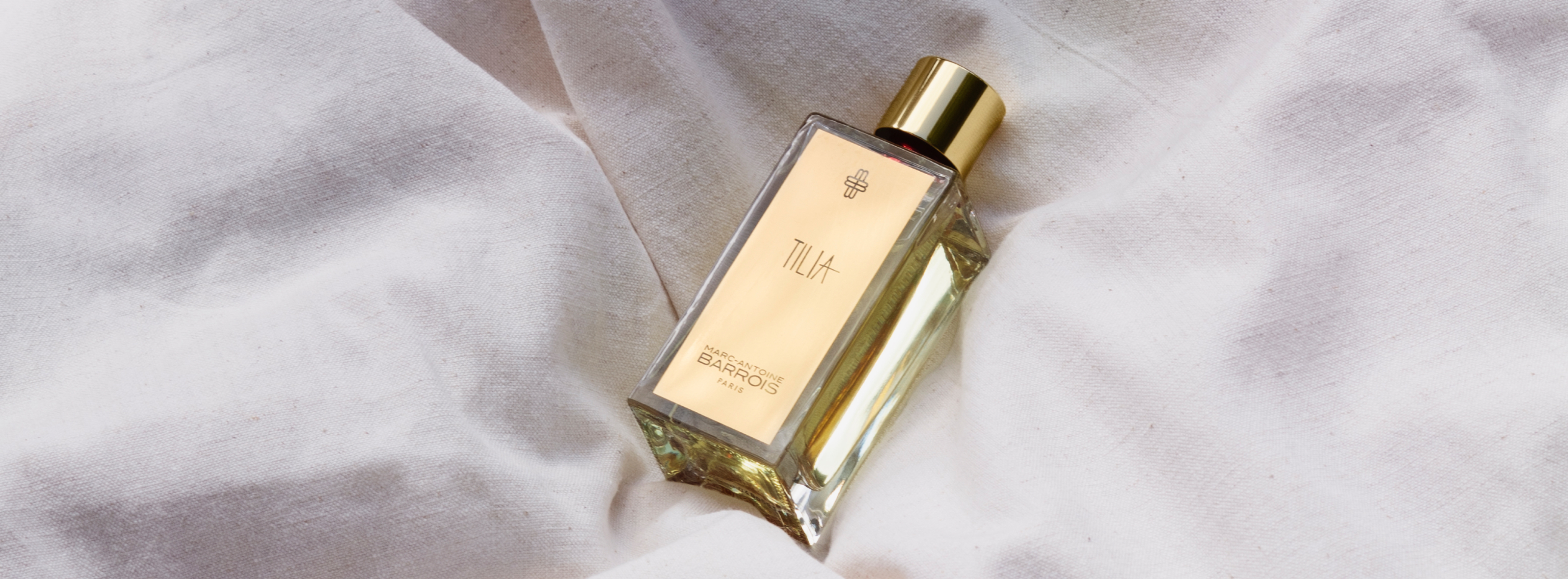
The product image pattern
The exact setup ProductCard uses: constrained layout, lazy loading, and Cloudflare 'pad' fit with a background so any aspect ratio fills a square without cropping.
.webp)
import { Image } from '@unpic/svelte';

<Image
	src={product.image}
	alt={product.name}
	width={276}
	height={276}
	layout="constrained"
	loading="lazy"
	decoding="async"
	cdn="cloudflare"
	options={{ cloudflare: { domain: 'cdn.agoratopia.com' } }}
	operations={{ cloudflare: { fit: 'pad', background: '#fbfbfb' } }}
/> Width + aspect ratio
Provide aspectRatio with one dimension and the other is derived. Handy when the design fixes the shape but not the pixel size.
.webp)
<!-- Give width + aspectRatio instead of both dimensions; height is derived. -->
<Image
	src={image}
	alt="Product shot"
	width={320}
	aspectRatio={4 / 3}
	layout="constrained"
	cdn="cloudflare"
	options={{ cloudflare: { domain: 'cdn.agoratopia.com' } }}
	operations={{ cloudflare: { fit: 'pad', background: '#fbfbfb' } }}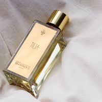
/> Fixed layout
Renders at exactly the given size on every screen; the srcset only contains 1x/2x density variants. Use it for avatars, thumbnails, and icons.
.webp)
.webp)
<!-- layout="fixed" renders at exactly width x height; the srcset only covers DPRs. -->
<Image
	src={image}
	alt="Thumbnail"
	width={96}
	height={96}
	layout="fixed"
	cdn="cloudflare"
	options={{ cloudflare: { domain: 'cdn.agoratopia.com' } }}
	operations={{ cloudflare: { fit: 'pad', background: '#fbfbfb' } }}
/> Full-width banner
fullWidth stretches to the container and generates srcset entries for the given breakpoints. Use aspectRatio (or height) so the space is reserved before the image loads.
<!-- layout="fullWidth" stretches to the container; use aspectRatio (or height) to reserve space. -->
<Image
	src={banner}
	alt="Campaign banner"
	layout="fullWidth"
	aspectRatio={16 / 5}
	breakpoints={[640, 960, 1280, 1920]}
	cdn="cloudflare"
	options={{ cloudflare: { domain: 'cdn.agoratopia.com' } }}
	operations={{ cloudflare: { fit: 'cover' } }}
/> Above the fold: priority
priority switches the image to loading='eager' and fetchpriority='high' - use it for the hero / LCP image only, and leave everything else lazy (the default).
<!-- For above-the-fold images (hero, LCP): priority sets loading="eager" + fetchpriority="high". -->
<Image src={hero} alt="Hero" layout="fullWidth" aspectRatio={16 / 5} priority ... />

<!-- Everything below the fold should stay lazy (the default). -->
<Image src={product.image} alt={product.name} width={276} height={276} loading="lazy" ... /> Placeholder background
background paints the reserved box while the file downloads, avoiding a white flash. Any CSS color or a tiny data-URI placeholder works.
.webp)
<!-- background paints the reserved box while the file loads (CSS color or tiny data URI). -->
<Image
	src={image}
	alt="Product shot"
	width={276}
	height={276}
	background="#e8ded2"
	cdn="cloudflare"
	options={{ cloudflare: { domain: 'cdn.agoratopia.com' } }}
/> Cloudflare operations
operations pass through to Cloudflare's edge transforms: cropping with automatic focal point, blur, tone adjustments, or forcing a format/quality. Left to right: cover + gravity auto, blur 40, brightness + sharpen, webp at quality 50.
.webp)
.webp)
<!-- operations map straight to Cloudflare image transforms. -->

<!-- Crop to fill, focal point picked automatically -->
operations={{ cloudflare: { fit: 'cover', gravity: 'auto' } }}

<!-- Blur (1-250), e.g. decorative backgrounds -->
operations={{ cloudflare: { fit: 'cover', blur: 40 } }}

<!-- Tone adjustments and sharpening -->
operations={{ cloudflare: { fit: 'pad', background: '#fbfbfb', brightness: 1.2, sharpen: 2 } }}

<!-- Force a format and quality -->
operations={{ cloudflare: { fit: 'pad', background: '#fbfbfb', format: 'webp', quality: 50 } }} Art direction with Source
The MediaSection pattern: wrap Source + Image in a picture element to serve a square crop on mobile and the wide original on desktop. Resize the window to see it switch at 48rem.

import { Image, Source } from '@unpic/svelte';

<!-- Art direction: a square crop on mobile, the wide original on desktop. -->
<picture>
	<Source
		media="(max-width: 48rem)"
		src={image}
		width={850}
		height={850}
		layout="constrained"
		cdn="cloudflare"
		options={{ cloudflare: { domain: 'cdn.agoratopia.com' } }}
		operations={{ cloudflare: { fit: 'cover' } }}
	/>
	<Image
		src={image}
		alt="Campaign"
		width={1920}
		height={850}
		layout="constrained"
		unstyled
		cdn="cloudflare"
		options={{ cloudflare: { domain: 'cdn.agoratopia.com' } }}
	/>
</picture> Unstyled with your own CSS
unpic normally sets inline sizing styles (max-width, aspect-ratio, object-fit). Pass unstyled to opt out and control the element entirely from your stylesheet - the srcset and sizes are still generated.
<!-- unstyled skips the inline sizing styles so your own CSS is in full control. -->
<Image
	src={image}
	alt="Product shot"
	width={276}
	height={276}
	layout="constrained"
	unstyled
	class="polaroid"
	cdn="cloudflare"
	options={{ cloudflare: { domain: 'cdn.agoratopia.com' } }}
	operations={{ cloudflare: { fit: 'pad', background: '#fbfbfb' } }}
/>

<style>
	:global(.polaroid) {
		width: 200px;
		height: auto;
		border: 8px solid #fff;
		box-shadow: 0 4px 14px rgb(0 0 0 / 20%);
		transform: rotate(-2deg);
	}
</style>